LaFuransu et moi
Learning French with a little pear
A full learning universe for kids from 3 years old: a talking mascot, an illustration system, 400+ printable pages, 850 recorded sounds and the site that serves them. And to think it all started at my kitchen table in Tokyo, with flashcards for my daughter…
Art Direction / Brand Identity / Webdesign / Print / Creative Coding
It all started with love
I live in Tokyo. My daughter is French and Japanese, and French is the language she hears the least. It is my mother tongue, the language of her grandparents on the other side of the planet, and of the books I read to her at bedtime.
So I started making things for her: flashcards, coloring pages, handwriting sheets, little sound games. Then I had the chance to teach in international classrooms, which confirmed that my way of teaching worked. Little by little, I laid it all out as a real printed book. Hundreds of pages, and it was almost done.
Then in May 2026 the French Ministry of Education changed its official handwriting model. Every letter in my book, drawn by hand to match the old one, was suddenly teaching the wrong shapes.
That hurt for a few days. Then I decided to rebuild everything from scratch, with Claude Code as a partner, as a website instead of a frozen PDF. Pages that still print beautifully, but that I can fix, extend and grow whenever I want.
LaFuransu et moi is the result: a mascot, an illustration world, more than 400 printable pages, 850 recordings, and the site that brings them together.
A pear called Lafuransu
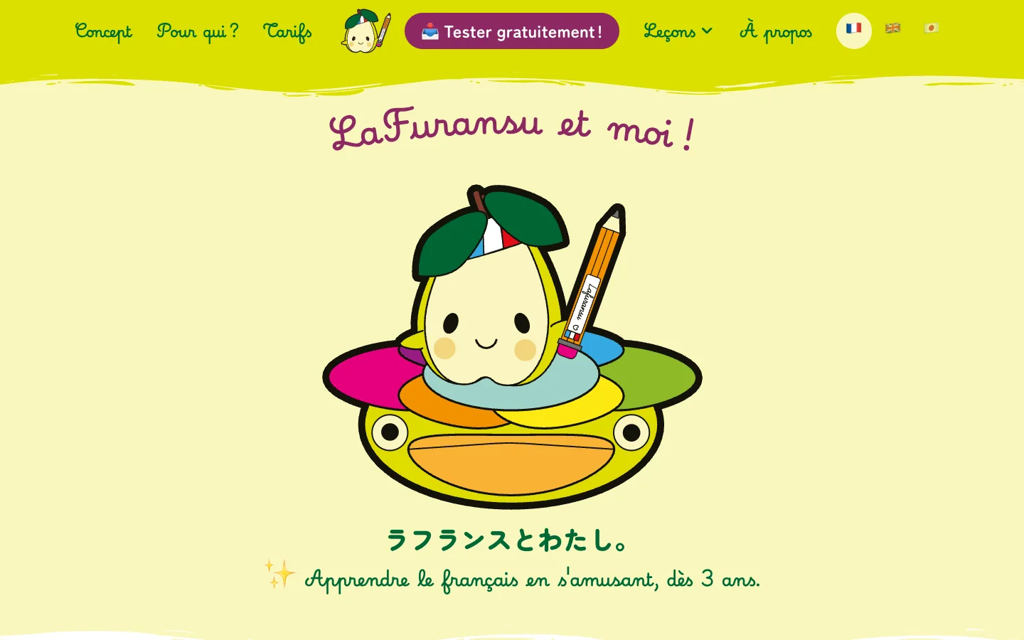
Say La France in Japanese and you get ラフランス, rafuransu. It is also the name of a pear sold in every Japanese supermarket. One word for my country and for a fruit my daughter already loves. The mascot designed itself.
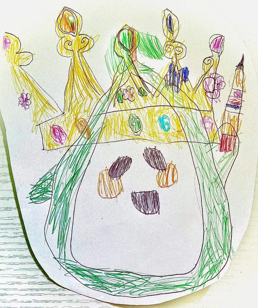
It had to be simple enough to print in black and white on a home printer, and to be easily redrawn by a child. That was what mattered most!
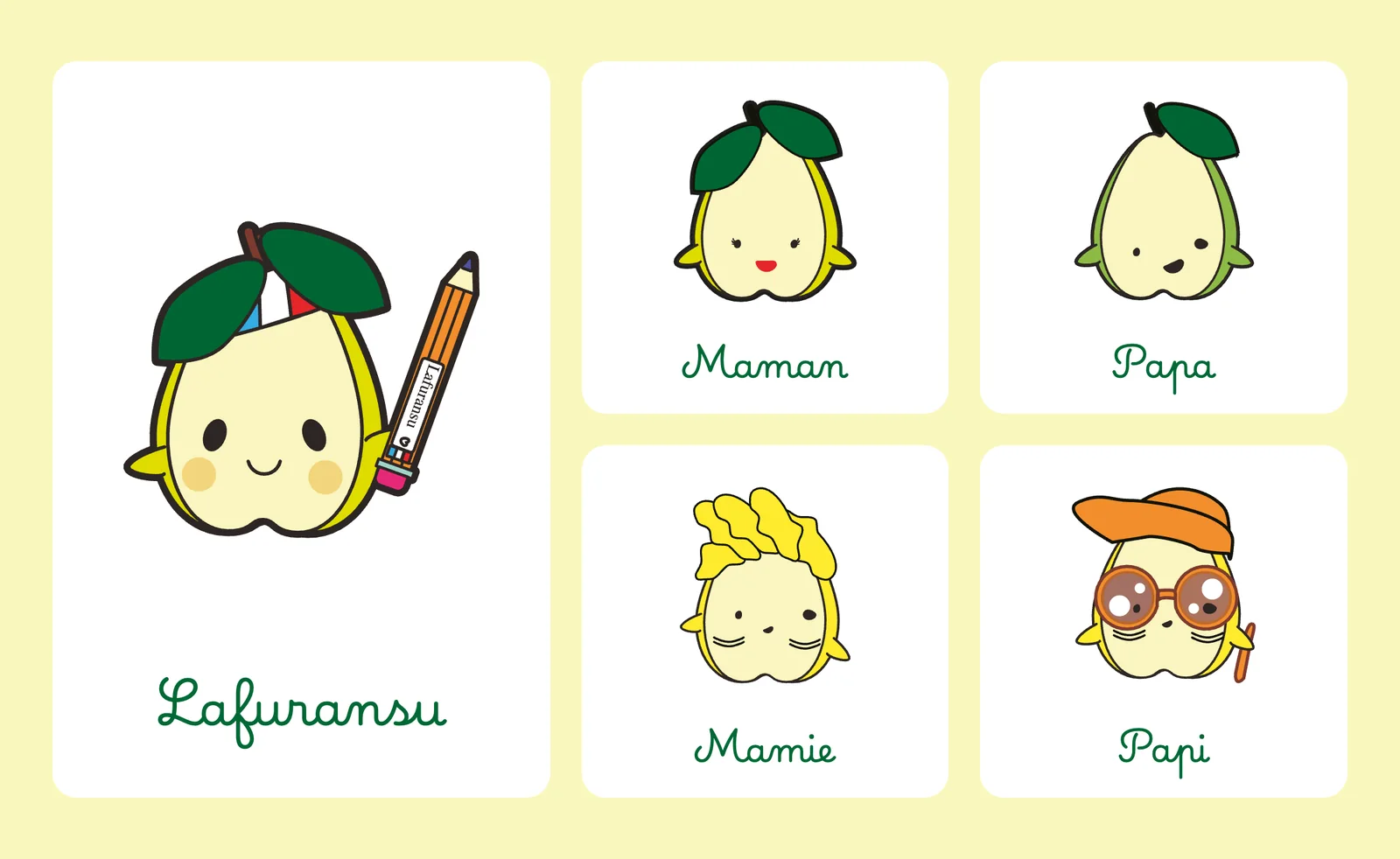
Lafuransu comes with a whole family, so little learners can see themselves in it!
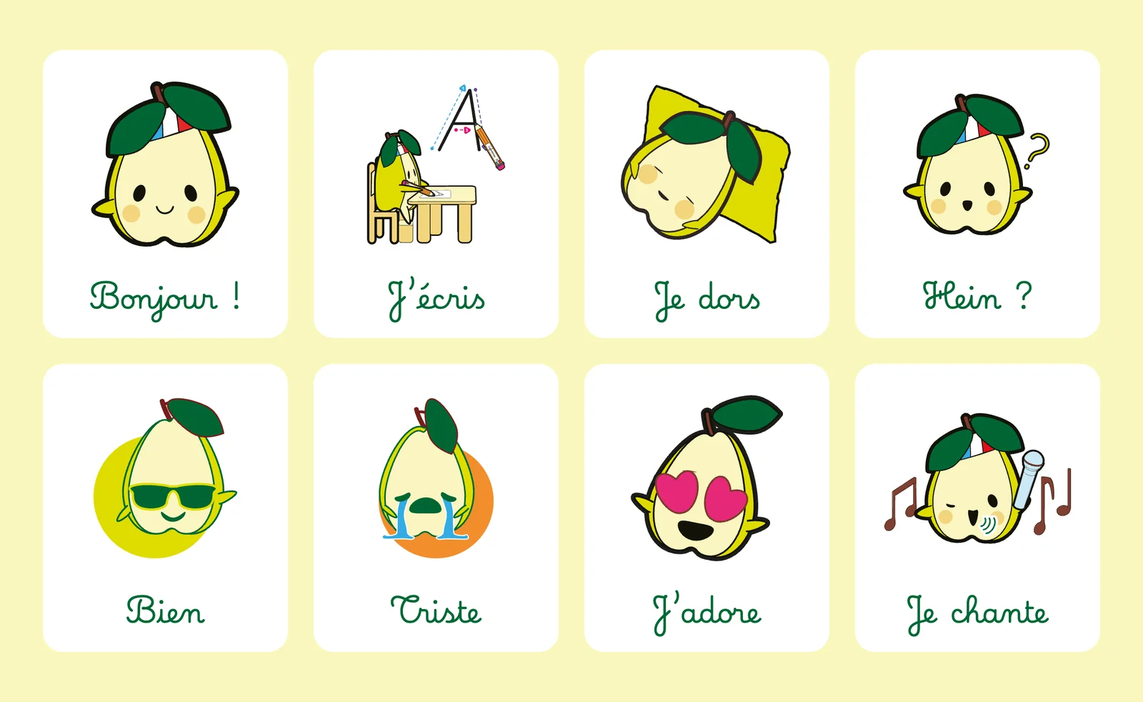
And just like little learners, Lafuransu has moods! It waves, writes, sleeps, gets things wrong, feels proud, feels sad. Kids pick them up and copy them quickly and easily!
On the homepage, it follows you with its eyes.
Colour, type, and the rounded rule
The colours had to look good on a screen and survive a cheap inkjet printer. So the palette is made of a few bold, flat colours: a forest green, an acid lime, a deep fuchsia, and a soft cream in place of white. Cream is softer than white and easier on the eyes, like in picture books.
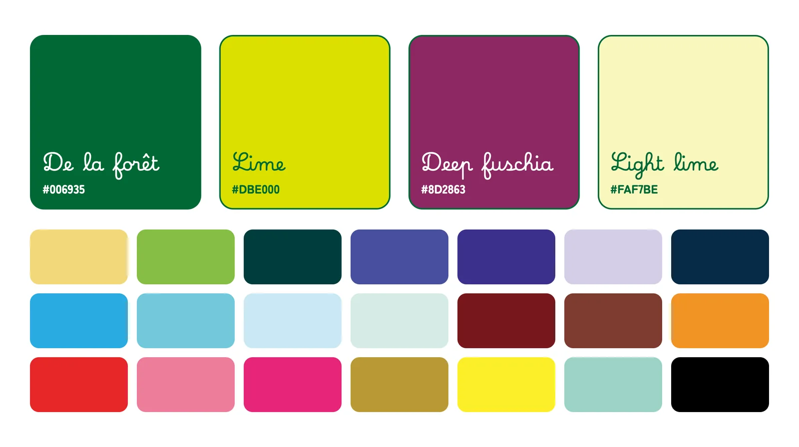
For the type, one rule: everything is round. The French text uses Marelle 2, the Ministry of Education’s new school model, the very font that sank the release of my first book. It now carries the whole site, and I like that ending! The Japanese uses Zen Maru Gothic, one of the few Japanese fonts with truly soft, rounded strokes, so both languages feel like the same world.
Four hundred pages
The content comes in three books:
- The starter kit, eight lessons to begin from zero
- The handwriting book, from first pencil gestures to capitals, cursive and numbers
- Les Lettres de Lafuransu, a letter from the pear every week for a year, across four seasons
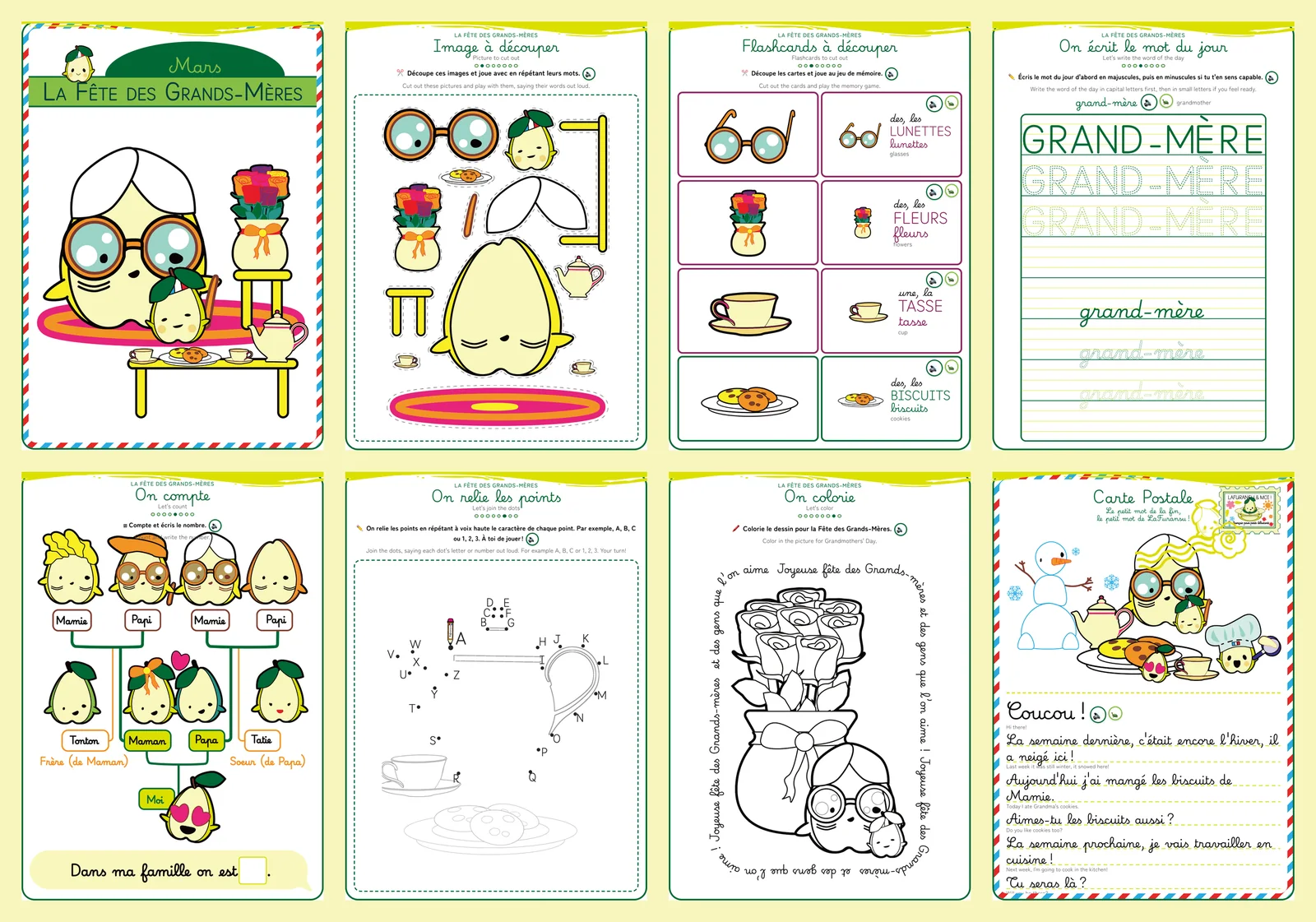
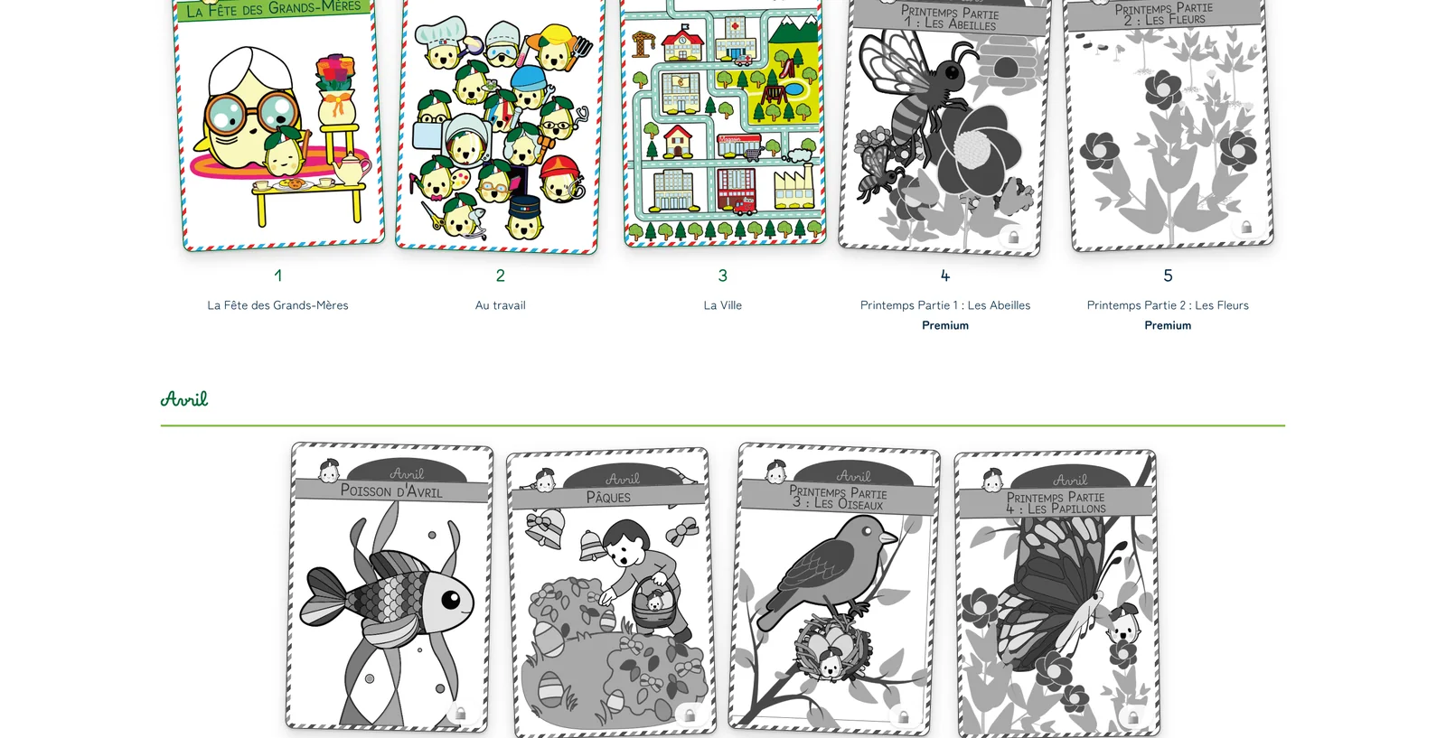
Each weekly lesson has eight pages: a cover, something to cut out, flashcards, the word of the day, counting, connect the dots, coloring, and a postcard from Lafuransu.
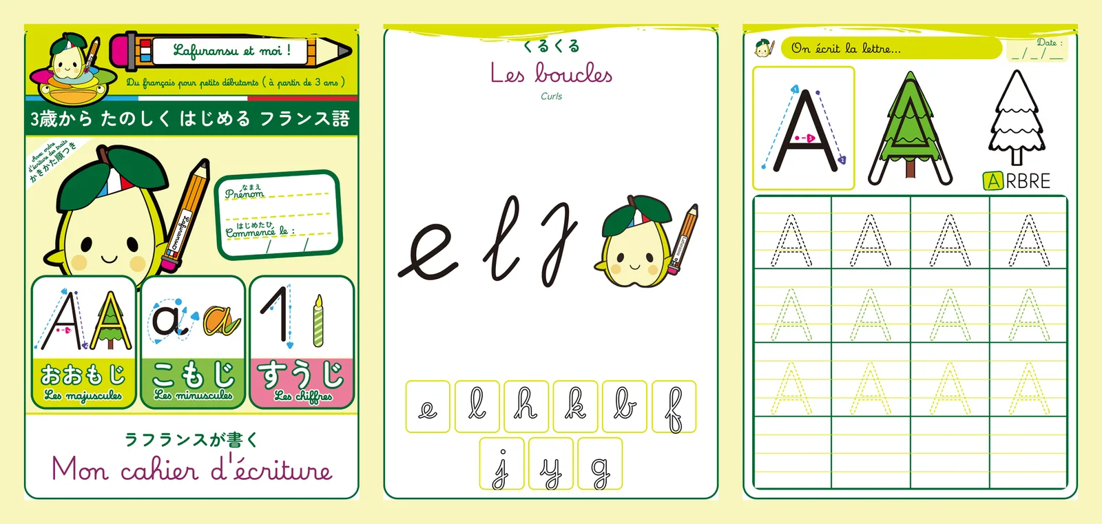
Going back to Illustrator and InDesign to redraw everything by hand a second time was out of the question! So every type of page became a template, and each lesson simply fills it in with its own words and pictures.
Adding a letter to the handwriting book now takes one line. And if the rules ever change again, every page updates at once.
A pear that talks
A three year old cannot read instructions. And a Japanese parent sitting next to them often cannot pronounce the words. Paper had no answer to that. A website could.
So I recorded everything a child needs to hear, in my own voice: every word, every instruction, every letter. The same voice my daughter hears at home. About 850 recordings in the end.
Tap a word in the picture and you hear it. And Lafuransu says it with you.
I animated the pear like a puppet, with a set of mouth shapes, and each recording is matched to them automatically. So when a word plays, the pear really moves its lips to it. It follows your cursor across the lesson, blinks, breathes, and stops to talk when you press a sound.
Kids can also color and scribble right on the screen, for the days when there is no printer around. Like a magic slate, nothing is saved.
Try before you buy!
A lot of the site is free on purpose: the first lessons of every book and every season, with the sound. For the rest, families pay once. They keep the printable books forever, and get a year of the full site with all the audio, renewable at a small price if they want more.
The paid pages are properly locked on the server, so they never reach a browser without access.
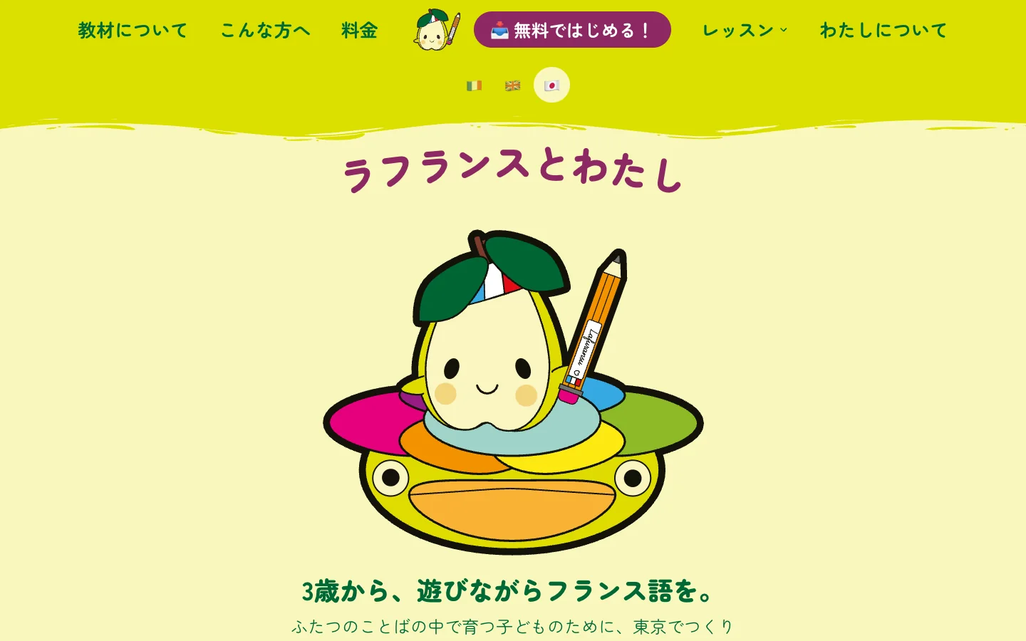
The site speaks French, English and Japanese, with prices in yen, euros and dollars. The lessons stay in French, since that is the whole point.
What I got out of it
Nobody briefed me on this one, and that made it harder. With no client to push back, the only test was putting a page in front of my daughter or another child, and seeing whether the interest and attention were there!
She corrected me more than any client ever has. The gestures pages exist because of the way she held her pencil. The pear’s expressions exist because I wanted to match her reactions and her friends’. The cream background is there because I didn’t want to burn their eyes.
Twenty years of design went into this: identity, illustration, print, web, code. And the brief almost came from a child who was three at the time :)
It is live at lafuransu.com, and it keeps growing, with video coming next. If you are raising a child between two languages, I hope it saves you a few evenings at the kitchen table!
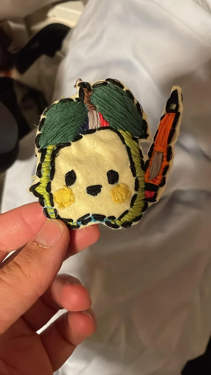
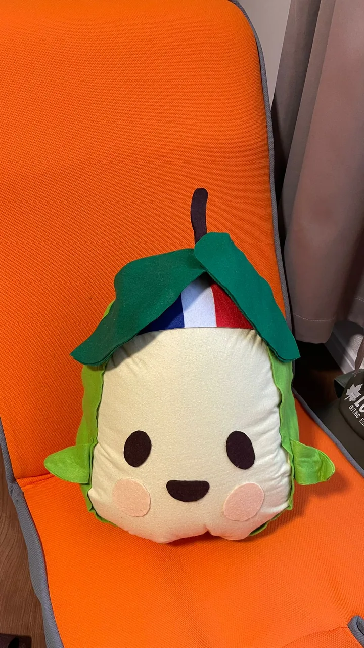
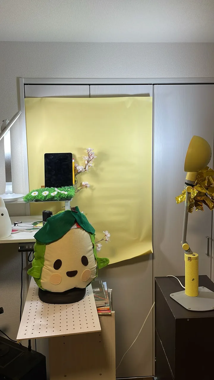
Behind the scenes, everything is handmade, and made with love: the embroidered patch, the sewn plush, even the little video studio.
And to hear Lafuransu talk, a few videos on YouTube: